My Role
• UX/UI Design
• Design System Contribution
• Search Tool Design
• Developer Handoff
• Design System Contribution
• Search Tool Design
• Developer Handoff
The Impact
Modified the search tool to create consistency across mobile and desktop, driving an 82% increase in map interactions within one month and a 20% rise in customer satisfaction.
The Project
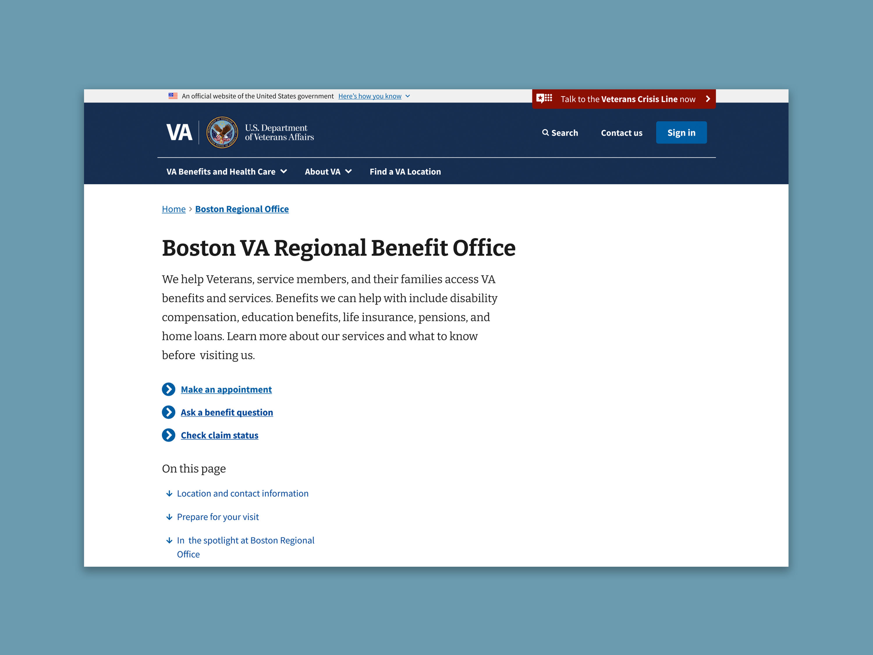
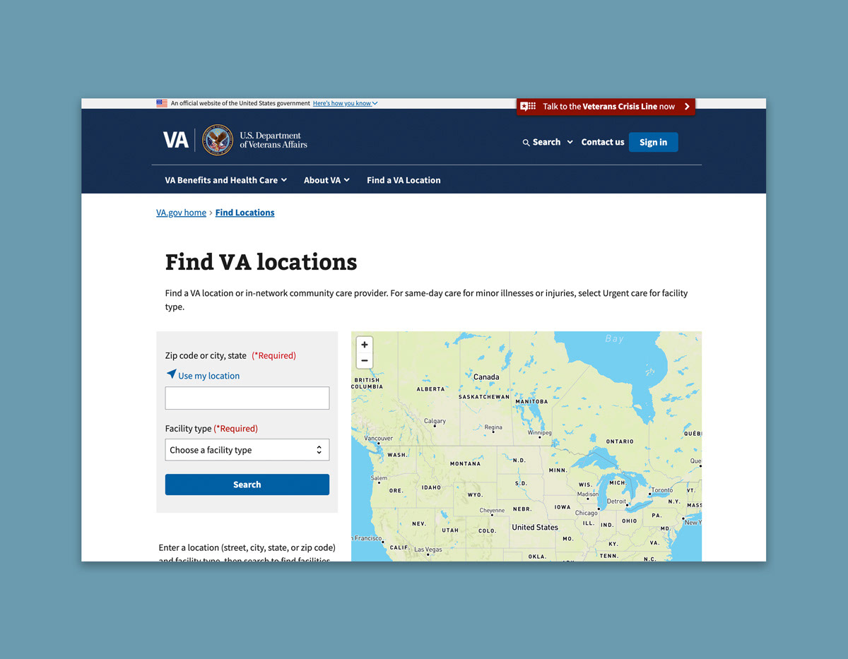
The facility locator search required two major improvements. The first was the implementation of progressive disclosure for the search fields. The design system team wanted only the most essential fields to be visible when the page loads, with additional fields appearing only as needed. This approach would improve usability, reduce cognitive load, and align the interface with design system guidance. The image below shows the search tool before this feature was introduced.
The second update focused on enhancing the mobile map experience. Previously, tapping a location on the map didn’t select a corresponding facility from the list or display any related information. This update needed to add that missing functionality, making the map more interactive and useful for users.
The second update focused on enhancing the mobile map experience. Previously, tapping a location on the map didn’t select a corresponding facility from the list or display any related information. This update needed to add that missing functionality, making the map more interactive and useful for users.

The Challenges
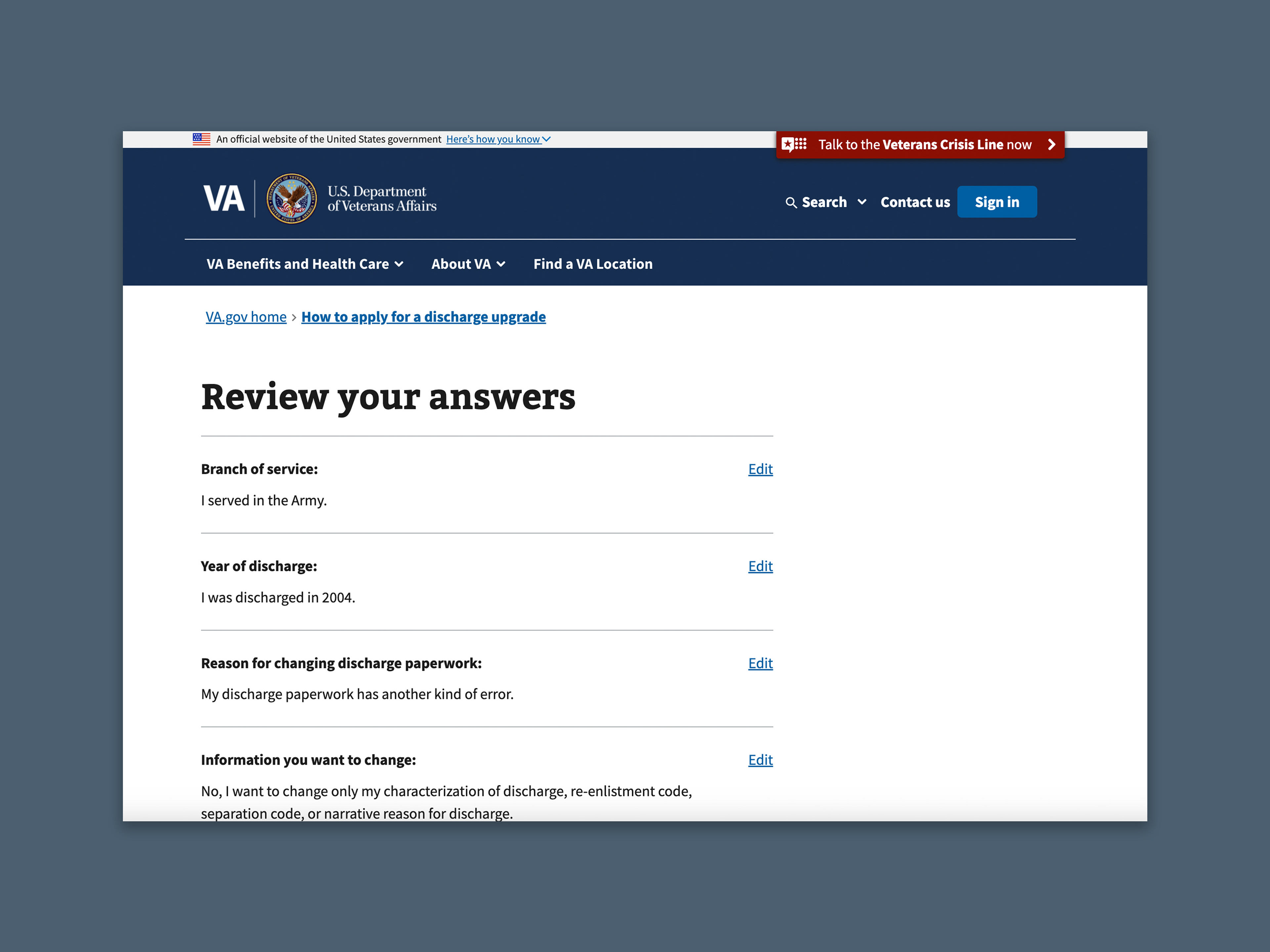
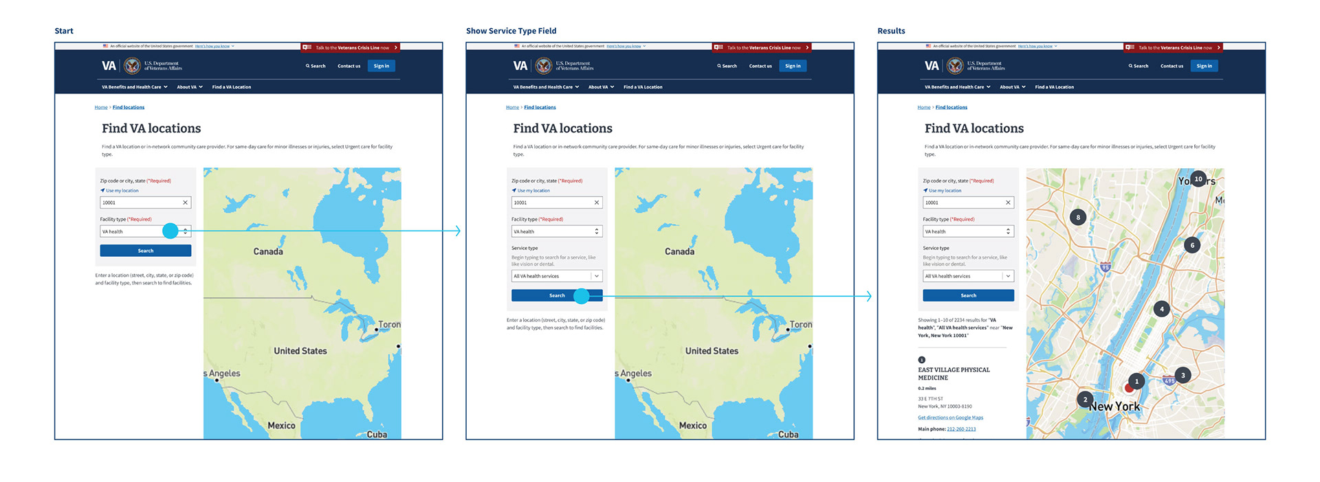
The facility locator search supports a variety of facility types, but not all of them include service types. For instance, VA health facilities offer service options like primary care, dental services, and cardiology, while VA cemeteries do not provide additional services and therefore don’t have associated service types. To support our developers, I mapped out each flow to clearly indicate which facility types should display the service type field and which should not.
The Solution
I outlined each user flow requiring the service type field and annotated my designs to help developers understand the intended experience. The most significant change involved relocating the search fields from above the map to the left side. This not only aligned the desktop and mobile layouts more closely but also made space for the service type field to appear dynamically, without pushing the map further down the page. The annotations detailed how the field should appear, included new help text, and described the expected results behavior.
For the mobile map update, I added a location icon to highlight the selected point on the map. I also updated the tab components to align with the design system and introduced a results section below the map, eliminating the need for users to switch between map and list views. This helped to align the mobile and desktop experiences.
For the mobile map update, I added a location icon to highlight the selected point on the map. I also updated the tab components to align with the design system and introduced a results section below the map, eliminating the need for users to switch between map and list views. This helped to align the mobile and desktop experiences.