My Role
• UX/UI Design
• Design System Contribution
• Prototype Creation
• Developer Handoff
• Design System Contribution
• Prototype Creation
• Developer Handoff
The Impact
Expanded and validated an existing design system pattern to improve navigation clarity and reduce cognitive load, contributing to a 47% increase in total users within a year.
The Project
Veterans needed a simple way to learn if their income could impact the health care they receive. As seen in the image below, the experience on the site at the time was confusing. The wording on the results table was often led to users misinterpreting income limits.
A new experience needed to be created that would clearly state income limits. It also needed to encourage Veterans to apply for health care even if their income was over the limit, because they could still be eligible for different services.
A new experience needed to be created that would clearly state income limits. It also needed to encourage Veterans to apply for health care even if their income was over the limit, because they could still be eligible for different services.
The Challenges
The design system team wanted to update how the questions displayed on the site and my team was looking for ways to reduce cognitive load, make the forms more accessible by improving the experience for screen readers, and reduce clutter on one page.
I worked with the design system team to create a new version of an existing pattern that would only show one question per page. We called this the sub-task pattern because it helps users complete a shorter task before, or within, a larger process or flow. Ideally, these income limit questions would be asked before a Veteran applied for VA health care.
I worked with the design system team to create a new version of an existing pattern that would only show one question per page. We called this the sub-task pattern because it helps users complete a shorter task before, or within, a larger process or flow. Ideally, these income limit questions would be asked before a Veteran applied for VA health care.
The Solution
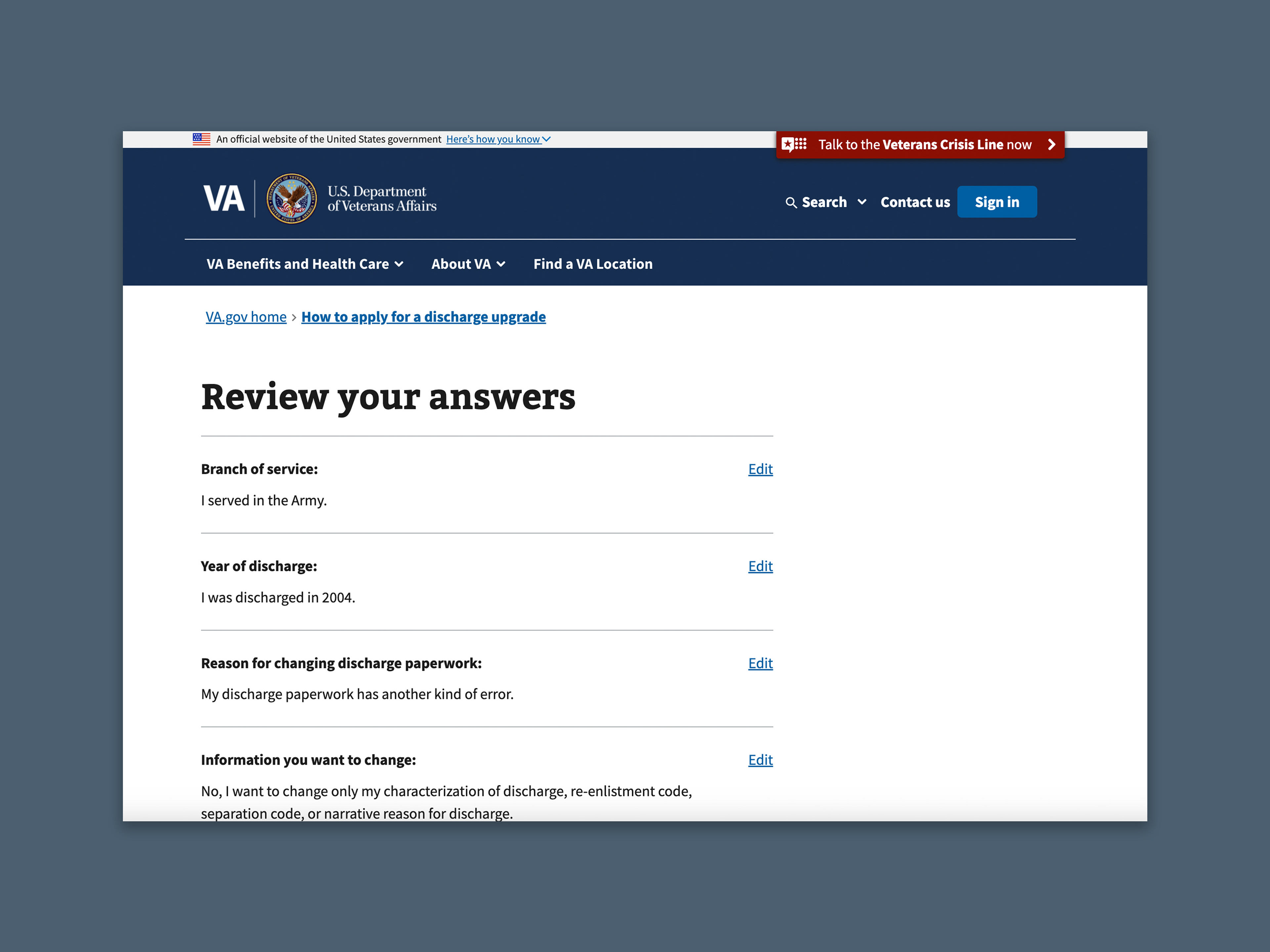
Using some existing designs that had already been implemented across the site, I expanded on the sub-task pattern by making the question the main header of the page, refined the review screen functionality, and worked with the content team to come up with a comprehensive results page.
After making those updates, we conducted usability testing. I created a prototype in Figma to test the new version of this pattern and determine if it worked better for users. After testing with Veterans and making a few changes, the sub-task pattern was concluded to be easier to navigate. Showing one question per page made the content easier to comprehend and improved the experience.
After making those updates, we conducted usability testing. I created a prototype in Figma to test the new version of this pattern and determine if it worked better for users. After testing with Veterans and making a few changes, the sub-task pattern was concluded to be easier to navigate. Showing one question per page made the content easier to comprehend and improved the experience.
